Pricing
The Pricing pattern shows a group of paid features or plan options for a user to make a selection.
// import the components for pricing patterns as required

import { Badge } from "@twilio-paste/core/badge";
import { Heading } from '@twilio-paste/core/heading';
import { Paragraph } from '@twilio-paste/core/paragraph';
import { Text } from '@twilio-paste/core/text';
import { Button } from '@twilio-paste/core/button';
import { DisplayHeading } from '@twilio-paste/core/display-heading';
import { Card } from '@twilio-paste/core/card';
import { Box } from '@twilio-paste/core/box';
import { VisualPickerRadio, VisualPickerRadioGroup } from "@twilio-paste/core/visual-picker";
import { Separator } from "@twilio-paste/core/separator";
import { SelectedIcon } from "@twilio-paste/icons/esm/SelectedIcon";
The Pricing pattern should be used when the user is presented with pricing or packaged options to select from. Use this pattern to clearly show the differences between different plans in order for the user to make an informed decision.
Examples:
- Selecting an account plan on upgrade.
- Switching between a free and paid feature.
- Adding a packaged plan to an account based on a use case.
The information presented in the layout will be dependent on the packaged plans themselves.
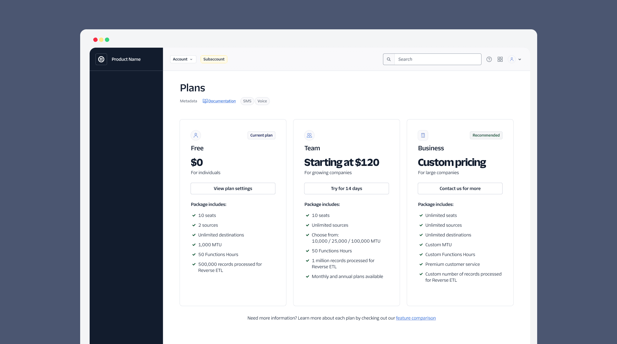
Pricing layouts should adhere to the following guidelines:
- Limit the number of pricing cards to 4, with a minimum of 2 as to not overwhelm users with options. For a larger quantity of plans, consider reducing the options or using a Table.
- Display the current plan (if any).
- Use a primary Button and Badge for the recommended option (if any), all other pricing cards use a secondary Button for selection.
- Limit the listed features to 8 items, focusing on the differences between each package
- If the lower packages are included in the higher end packages, we recommend the first line item of the next package mention the previous plan. Example: “All features from Basic plan”.
- Always order the cards left to right from least expensive to most expensive, or least number/value of features to most number/value of features. The current selection remains in this order (it does not move to the beginning of the list).
Guidance for payment flows is in development
If you’re working on a new paid feature or plan, reach out in #help-design-system to get connected with teams who are working to standardize our payment flows. They can provide guidance on how to handle role or account based states for paid products.
While this is happening, continue partnering with Commerce Platform for your feature.
| Component | Guidelines |
|---|---|
| Badge | Use a decorative Badge to highlight a “recommended” plan and for a customer’s current plan or the status of that current plan. We recommend a maximum of 2 badges total, to not overwhelm the users. Use the placeholder text to add more detail about the plan. |
| Heading | This is a smaller heading used for displaying the plan name or other details if including the plan name as the display heading. Refer to the heading documentation for accessibility of headers. |
| Display Heading | Use this largest heading for displaying the price of the plan. If the price is not available, it can be used to display the plan name. |
| Paragraph subheader | A subheader or details can be placed in a Paragraph above or below the display heading. Use this to add additional context to the price or plan. For example “Included” or “Plus fees” or “Best for XYZ”. |
| Button (card variant) | Use a secondary button to select the plan using the text “Select plan”. For the current plan, hide the button or show a CTA. For example, it could navigate to the feature the user has already selected. |
| Feature list (icon + paragraph) | Use this list to outline the differences between each plan. Include 1-8 features, the first feature listed should be anything included in previous features (if any). For example “Packaged plan 1 features” |
| More info Anchor or Button (Card variant) | Use an optional Anchor or Button at the bottom of the card to link to additional documentation or details about the plan that can’t fit in the card. This should go to a new page or open a Modal, not expand the card. Follow guidelines for using a Button or Anchor: Use a link-style Button when the user is performing an action to open a Modal, and an Anchor when it’s navigating to a new page. |
Use the card layout to display the user’s options on pages that may redirect to a Wizard flow or when this selection is the only step (besides a confirmation) the user needs to take to change their plan.
The buttons on these cards can redirect to a billing flow. The card also allows for more detail about the plan.
export const CardPricingExample = (): React.ReactNode => {
  return (
    <Box
      display="grid"
      gridTemplateColumns="repeat(auto-fit, minmax(min(264px, 100%), 1fr));"
      columnGap="space70"
      rowGap="space70"
      maxWidth="1248px"
    >
      <Card>
        <Box display="flex" flexDirection="column" rowGap="space70">
          <Box display="flex" flexDirection="column" rowGap="space40">
            <Box display="flex" justifyContent="space-between" alignItems="center">
              <Avatar name="user" icon={icon} variant={isEntity ? "entity" : "user"} />
              <Badge as="span" variant="neutral">
                Current plan
              </Badge>
            </Box>
            <Heading marginBottom="space0" as="h2" variant="heading30">
              Team
            </Heading>
            <Box marginTop="space40" marginBottom="space20">
              <DisplayHeading marginBottom="space0" as="h3" variant="displayHeading30">
                Starting at $120
              </DisplayHeading>
            </Box>
            <Paragraph marginBottom="space0">Per month</Paragraph>
          </Box>
          <Button variant="secondary">Try for 14 days</Button>
          <Box display="flex" flexDirection="column" rowGap="space50">
            <Heading marginBottom="space0" as="h3" variant="heading50">
              Package includes:
            </Heading>
            {[
              "10 seats",
              "2 sources",
              "Unlimited destinations",
              "1,000 MTU",
              "50 Function hours",
              "500,000 records processed for Reverse ETL",
            ].map((item: string) => (
              <Box key={item} display="flex" columnGap="space20" alignItems="center">
                <SelectedIcon decorative color="colorTextIconSuccess" />
                <Text as="p">{item}</Text>
              </Box>
            ))}
          </Box>
        </Box>
      </Card>
      {...}
    </Box>
  )
}Use a Visual Picker when the selection is happening in a wizard and the user will be continuing on to additional steps besides a simple confirmation (e.g., payment information).
The Visual Picker should be more succinct in the detail it shares.
export const VisualPickerExample = (): React.ReactNode => {
  const [value, setValue] = React.useState('Free trial');
  return (
    <VisualPickerRadioGroup
      orientation="horizontal"
      legend="Select an option"
      name="visual-picker"
      value={value}
      onChange={(newValue) => setValue(newValue)}
    >
      <VisualPickerRadio labelText="Free trial value="Free trial>
        <Box>
          <Box display="flex" columnGap="space30" justifyContent="space-between" alignItems="flex-start">
            <Heading as="h2" variant="heading40" marginBottom="space0">
              Free trial
            </Heading>
            <Badge as="span" variant="decorative30">
              Recommended
            </Badge>
          </Box>
          <Box marginTop="space30" display="flex" columnGap="space20" alignItems="flex-end">
            <Heading as="h3" variant="heading10" marginBottom="space0">
              $0
            </Heading>
            <Paragraph marginBottom="space0">Per month</Paragraph>
          </Box>
        </Box>
        <Box marginY="space50">
          <Separator orientation="horizontal" />
        </Box>
        <Box display="flex" flexDirection="column" rowGap="space50">
          {["$15 credit", "Testing with upto 5 verified recipients", "Limited configurations"].map((item: string) => (
            <Box key={item} display="flex" columnGap="space20" alignItems="center">
              <SelectedIcon decorative color="colorTextIconSuccess" />
              <Text as="p">{item}</Text>
            </Box>
          ))}
        </Box>
      </VisualPickerRadio>
      {...}
    </VisualPickerRadioGroup>
  )
}Consider using a table when there are more than 4 options for users to choose from, or more comparison is necessary between any number of plans.
export const TableExample = (): React.ReactNode => {
  return (
    <DataGrid aria-label="Pricing table">
      <DataGridHead>
        <DataGridRow>
          <DataGridHeader> </DataGridHeader>
          <DataGridHeader>
            <Box display="flex" flexDirection="column" rowGap="space20">
              Developer
              <Badge as="span" variant="neutral">
                Current plan
              </Badge>
            </Box>
          </DataGridHeader>
          <DataGridHeader>Production</DataGridHeader>
          <DataGridHeader>
            <Box display="flex" flexDirection="column" rowGap="space20">
              Business
              <Badge as="span" variant="decorative30">
                Recommended
              </Badge>
            </Box>
          </DataGridHeader>
          <Th>Personalized</Th>
        </DataGridRow>
      </DataGridHead>
      <DataGridBody>
        <DataGridRow>
          <DataGridCell>Price per month</DataGridCell>
          <DataGridCell>Included</DataGridCell>
          <DataGridCell>
            4% of monthly spend <DetailText marginTop="space0">or $250 minimum</DetailText>
          </DataGridCell>
          <DataGridCell>
            6% of monthly spend <DetailText marginTop="space0">or $1,500 minimum</DetailText>
          </DataGridCell>
          <DataGridCell>
            8% of monthly spend <DetailText marginTop="space0">or $5,000 minimum</DetailText>
          </DataGridCell>
        </DataGridRow>
        <DataGridRow>
          <DataGridCell>Web support</DataGridCell>
          <DataGridCell>
            <SelectedIcon decorative color="colorTextIconAvailable" />
          </DataGridCell>
          <DataGridCell>
            <SelectedIcon decorative color="colorTextIconAvailable" />
          </DataGridCell>
          <DataGridCell>
            <SelectedIcon decorative color="colorTextIconAvailable" />
          </DataGridCell>
          <DataGridCell>
            <SelectedIcon decorative color="colorTextIconAvailable" />
          </DataGridCell>
        </DataGridRow>
        <DataGridRow>
          <DataGridCell>
            Guaranteed response times <DetailText marginTop="space0">Business critical</DetailText>
          </DataGridCell>
          <DataGridCell> </DataGridCell>
          <DataGridCell>3 business hours</DataGridCell>
          <DataGridCell>1 hour (24x7)</DataGridCell>
          <DataGridCell>1 hour (24x7)</DataGridCell>
        </DataGridRow>
        {...}
      </DataGridBody>
    </DataGrid>
  )
}For larger viewports, cards and pickers should be side-by-side. For smaller viewports, stack the cards or picker vertically.
For cards, the height of the cards should be equal to each other even if the number of features, badges, or buttons are different. You can use CSS Grid to ensure the cards are the same height.
Tip: If the total height of the cards is too long for small viewports, consider using a Summary Detail to collapse the package features, displaying them only when the user interacts with it.
export const CardPricingExample = (): React.ReactNode => {
  return (
    <Box
      display="grid"
      gridTemplateColumns="repeat(auto-fit, minmax(min(260px, 100%), 1fr));"
      columnGap="space50"
      rowGap="space50"
    >
      <Card>
        <Box display="flex" flexDirection="column" rowGap="space70">
          <Box display="flex" flexDirection="column" rowGap="space40">
            <Box display="flex" justifyContent="space-between" alignItems="center">
              <Heading marginBottom="space0" as="h2" variant="heading30">
                Team
              </Heading>
              <Badge as="span" variant="neutral">
                Current plan
              </Badge>
            </Box>
            <Box marginTop="space40" marginBottom="space20">
              <DisplayHeading marginBottom="space0" as="h3" variant="displayHeading30">
                Starting at $120
              </DisplayHeading>
            </Box>
            <Paragraph marginBottom="space0">Per month</Paragraph>
          </Box>
          <Button variant="secondary">Try for 14 days</Button>
          <SummaryDetail>
            <SummaryDetailHeading>
              <SummaryDetailToggleButton />
              <SummaryDetailHeadingContent>
                <Heading variant="heading50" as="h3" marginBottom="space0">
                  Package includes
                </Heading>
              </SummaryDetailHeadingContent>
            </SummaryDetailHeading>
            <SummaryDetailContent>
              <Box display="flex" flexDirection="column" rowGap="space40">
                {[
                  "10 seats",
                  "2 sources",
                  "Unlimited destinations",
                  "1,000 MTU",
                  "50 Function hours",
                  "500,000 records processed for Reverse ETL",
                ].map((item: string) => (
                  <Box key={item} display="flex" columnGap="space20" alignItems="flex-start">
                    <SelectedIcon decorative color="colorTextIconSuccess" size="sizeIcon40" />
                    <Text as="p">{item}</Text>
                  </Box>
                ))}
              </Box>
            </SummaryDetailContent>
          </SummaryDetail>
        </Box>
      </Card>
      {...}
    </Box>
  )
}By default, the Figma component is built with predefined minimum and maximum widths.
The auto layout settings ensure that the number of features, badges, avatars, or buttons don’t affect the card height, and the "More info" button stays anchored at the bottom. In order to maintain proper space in between card elements you may need to manually adjust the card group container height.
Do
Only include the additional features in the list of each plan.
Don't
Don’t show the negative or missing features of each product, or change the icon to an “X”.
Do
Include the “free” or “included” plan even if it's default on the account.
Don't
Don’t only have 1 pricing Card on a page. Users should see all of their options.
Do
Keep the content of the feature list succinct and jargon-free; use the “more info” option for more info.
Don't
Don’t put a large amount of content in a feature item, and don’t put more than 8 features