Data Visualization
Data visualizations help communicate patterns and relationships in a data set.
This foundation page was created to help establish a familiar and accessible user experience when interacting with data visualization across all Twilio products. These recommendations should enable you to tell accurate and convincing stories around data in a visually consistent and accessible manner.
The easiest way to use the data visualization tokens in your charts is to use usePasteHighchartsTheme from the data visualization library package with Highcharts. The usePasteHighchartsTheme hook takes an object of Highchart configurations and returns a new object with Paste colors and fonts.
Be sure to include the Highcharts Accessibility module to ensure that your charts are accessible to all users.
The design systems team maintains a Highcharts license for Twilio Console, SendGrid, Flex, Segment, and internal tools. If you are a Twilio customer building with Highcharts, you'll need your own license.
const LineChartExample = () => {applyPasteHighchartsModules(Highcharts, HighchartsAccessibilityModule);const themedLineChartOptions = usePasteHighchartsTheme(LineChartOptions);return <HighchartsReact highcharts={Highcharts} options={themedLineChartOptions} />;};render(<LineChartExample />);
To start using data visualization in your own Twilio customer experiences and prototypes, you can use the Highcharts Core Figma plugin.
The color palette used for data visualizations is available as variables in all themes. However to use the Highcharts Figma plugin, you'll have to copy the colors into the local variables in your file according to the Highcharts plugin's theme.
Not every part of a chart is themeable through the plugin, so you still won't get an exact match of charts built in production. Use the plugin for ideation purposes rather than for exact specs.
Alternatively, you could use Highcharts GPT to generate charts and SVG images to copy into Figma.
The color palette for data visualizations is a select subset of the Paste Unified Design Language color palette. It is designed to maximize accessibility and harmony within a page.
In the following sections, we’ll detail each palette we recommend using for your data visualizations and how you should be using them. You can also reference all the data visualization color palettes on our Design Tokens page.
Categorical (or qualitative) palettes are derived from colors of different hues but uniform saturation and intensity. They help users visualize unrelated data points of completely dissimilar origin or unrelated values. An example of a categorical palette is use is this visualization of different ethnicities in New York City. There is no correlation between the data for different ethnicities and a categorical palette is therefore used here.
An example of a non-categorical palette would be a sequential color palette (although we don’t yet have this type of color palette available), which is composed of varying intensities of a single hue of color at uniform saturation. An example of this would be this monthly state retail sales visualization. The same hue is used to create a correlation between the different monthly retail sales data points that were recorded in each state.
The categorical palette is fully 3:1 contrast-accessible against our $color-background-body token and has >2:1 contrast between neighboring colors. Since the contrast between neighboring colors falls short of the WCAG 2.1 AA requirement for non-text contrast, we will also include color-agnostic accessibility recommendations to assist with data read, which will be detailed in additional accessibility for charts section.
Be mindful about how you apply this palette.
The colors of this palette should be applied in sequence strictly as described. The sequence is carefully curated to maximize contrast between neighboring colors to help with visual differentiation. You can start anywhere in the sequence, but be sure to follow the remaining order (i.e. You can start with 5, as long as you use the rest of the sequence in order: 6, 7, 8, 9, 10, 1, 2, 3, 4).
- $color-data-visualization-1
- $color-data-visualization-2
- $color-data-visualization-3
- $color-data-visualization-4
- $color-data-visualization-5
- $color-data-visualization-6
- $color-data-visualization-7
- $color-data-visualization-8
- $color-data-visualization-9
- $color-data-visualization-10
Each element included in a chart plays an important role in data communication. In this section we’ll provide recommendations on how to style and locate the auxiliary elements such as chart titles, axis titles, legends, etc. More detail will be provided soon!
Choosing the most appropriate chart type is critical in telling the most convincing stories around data. In this section we’ll be providing recommendations on which charts to use and when. More detail will be provided soon!
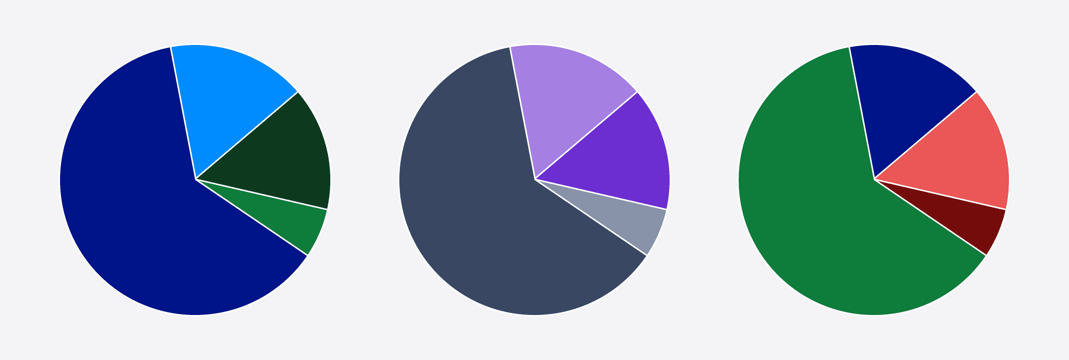
Although we’ve ensured that the recommended data visualization colors are 3:1 accessible against the background, it’s not possible to keep them 3:1 accessible against each other at the same time. So for charts that are using the categorical palette, we recommend using a divider line to separate any touching colors which also help to differentiate between categories.
An example showing the use of divider lines is this pie chart categorizing the race diversity index in the U.S. from the 2010 census data. A white divider line is used to create contrast and help distinguish the difference between the categories.
Shapes can also be used in combination with color-coded data points. Using shapes in addition to color adds another layer of differentiation so that charts are not relying solely on color to communicate meaning.

Highcharts by default does not include its Accessibility module. Every Highcharts license includes the Accessibility module which adheres to the WCAG 2.1 standard and adds enhanced keyboard navigation and screen reader functionality.
A helper function applyPasteHighchartsModules is available from the data visualization library package, which applies additional modules to Highcharts. This function should be called at the component level where the Highcharts namespace is passed to HighchartsReact.
import Highcharts from "highcharts";
import HighchartsReact from "highcharts-react-official";
import HighchartsAccessibilityModule from "highcharts/modules/accessibility";
import HighchartsExportingModule from "highcharts/modules/exporting";
import { applyPasteHighchartsModules } from "@twilio-paste/data-visualization-library";

applyPasteHighchartsModules(Highcharts, HighchartsAccessibilityModule, HighchartsExportingModule);

const LineChartExample = () => {
  return <HighchartsReact highcharts={Highcharts} />;
};